
ELEC-E7890 - User Research
Lecture 4 - Data Visualization
Aurélien Nioche
Aalto University
Setup Python environment 
# Import the libraries
import pandas as pd
import numpy as np
import math
import os
import seaborn as sns
import matplotlib
import matplotlib.pyplot as plt
import matplotlib.patches as patches
import matplotlib.gridspec as gridspec
import scipy.stats as stats
import gzip
%config InlineBackend.figure_format='retina' # For not burning your eyes
sns.set_theme(context="notebook", style="white") # Use nice Searborn settings
Data visualization: Why?
Let's take an example...
Case adapted from Rougier et al. (2014) (see GitHub repo), itself adapted from The New York Times.
Load the data 
df = pd.read_csv("data_lec4/diseases.csv")
df
Visualization 
Plot function 
Yes, it is a looooooot of code for one figure!
def make_plot():
# Reset default settings
sns.reset_orig()
# Choose some nice colors
matplotlib.rc('axes', facecolor = 'white')
matplotlib.rc('figure.subplot', wspace=.65)
matplotlib.rc('grid', color='white')
matplotlib.rc('grid', linewidth=1)
# Make figure background the same colors as axes
fig = plt.figure(figsize=(12,7), facecolor='white')
# ---WOMEN data ---
axes_left = plt.subplot(121)
# Keep only top and right spines
axes_left.spines['left'].set_color('none')
axes_left.spines['right'].set_zorder(10)
axes_left.spines['bottom'].set_color('none')
axes_left.xaxis.set_ticks_position('top')
axes_left.yaxis.set_ticks_position('right')
axes_left.spines['top'].set_position(('data',len(diseases)+.25))
axes_left.spines['top'].set_color('w')
# Set axes limits
plt.xlim(200000,0)
plt.ylim(0,len(diseases))
# Set ticks labels
plt.xticks([150000, 100000, 50000, 0],
['150,000', '100,000', '50,000', 'WOMEN'])
axes_left.get_xticklabels()[-1].set_weight('bold')
axes_left.get_xticklines()[-1].set_markeredgewidth(0)
for label in axes_left.get_xticklabels():
label.set_fontsize(10)
plt.yticks([])
# Plot data
for i in range(len(women_deaths)):
H,h = 0.8, 0.55
# Death
value = women_cases[i]
p = patches.Rectangle(
(0, i+(1-H)/2.0), value, H, fill=True, transform=axes_left.transData,
lw=0, facecolor='red', alpha=0.1)
axes_left.add_patch(p)
# New cases
value = women_deaths[i]
p = patches.Rectangle(
(0, i+(1-h)/2.0), value, h, fill=True, transform=axes_left.transData,
lw=0, facecolor='red', alpha=0.5)
axes_left.add_patch(p)
# Add a grid
axes_left.grid()
plt.text(165000,8.2,"Leading Causes\nOf Cancer Deaths", fontsize=18,va="top")
plt.text(165000,7,"""In 2007, there were more\n"""
"""than 1.4 million new cases\n"""
"""of cancer in the United States.""", va="top", fontsize=10)
# --- MEN data ---
axes_right = plt.subplot(122, sharey=axes_left)
# Keep only top and left spines
axes_right.spines['right'].set_color('none')
axes_right.spines['left'].set_zorder(10)
axes_right.spines['bottom'].set_color('none')
axes_right.xaxis.set_ticks_position('top')
axes_right.yaxis.set_ticks_position('left')
axes_right.spines['top'].set_position(('data',len(diseases)+.25))
axes_right.spines['top'].set_color('w')
# Set axes limits
plt.xlim(0,200000)
plt.ylim(0,len(diseases))
# Set ticks labels
plt.xticks([0, 50000, 100000, 150000, 200000],
['MEN', '50,000', '100,000', '150,000', '200,000'])
axes_right.get_xticklabels()[0].set_weight('bold')
for label in axes_right.get_xticklabels():
label.set_fontsize(10)
axes_right.get_xticklines()[1].set_markeredgewidth(0)
plt.yticks([])
# Plot data
for i in range(len(men_deaths)):
H,h = 0.8, 0.55
# Death
value = men_cases[i]
p = patches.Rectangle(
(0, i+(1-H)/2.0), value, H, fill=True, transform=axes_right.transData,
lw=0, facecolor='blue', alpha=0.1)
axes_right.add_patch(p)
# New cases
value = men_deaths[i]
p = patches.Rectangle(
(0, i+(1-h)/2.0), value, h, fill=True, transform=axes_right.transData,
lw=0, facecolor='blue', alpha=0.5)
axes_right.add_patch(p)
# Add a grid
axes_right.grid()
# Y axis labels
# We want them to be exactly in the middle of the two y spines
# and it requires some computations
for i in range(len(diseases)):
x1,y1 = axes_left.transData.transform_point( (0,i+.5))
x2,y2 = axes_right.transData.transform_point((0,i+.5))
x,y = fig.transFigure.inverted().transform_point( ((x1+x2)/2,y1) )
plt.text(x, y, diseases[i], transform=fig.transFigure, fontsize=10,
horizontalalignment='center', verticalalignment='center')
# Devil hides in the details...
arrowprops = dict(arrowstyle="-",
connectionstyle="angle,angleA=0,angleB=90,rad=0")
x = women_cases[-1]
axes_left.annotate('NEW CASES', xy=(.9*x, 11.5), xycoords='data',
horizontalalignment='right', fontsize= 10,
xytext=(-40, -3), textcoords='offset points',
arrowprops=arrowprops)
x = women_deaths[-1]
axes_left.annotate('DEATHS', xy=(.85*x, 11.5), xycoords='data',
horizontalalignment='right', fontsize= 10,
xytext=(-50, -25), textcoords='offset points',
arrowprops=arrowprops)
x = men_cases[-1]
axes_right.annotate('NEW CASES', xy=(.9*x, 11.5), xycoords='data',
horizontalalignment='left', fontsize= 10,
xytext=(+40, -3), textcoords='offset points',
arrowprops=arrowprops)
x = men_deaths[-1]
axes_right.annotate('DEATHS', xy=(.9*x, 11.5), xycoords='data',
horizontalalignment='left', fontsize= 10,
xytext=(+50, -25), textcoords='offset points',
arrowprops=arrowprops)
plt.show()
Show plot 
make_plot()

Compare with just a view on the table: the visualization of the data definitely help to have a quick understanding of it!
Transmit the right message
Do NOT burn steps
Remember the dinosaur
Load data 
Let's load the data from circle-data.csv
# Load the data
df = pd.read_csv("data/circle-data.csv", index_col=0)
df
Let's load the data from dino-data.csv
# Load the data
df_other = pd.read_csv("data/dino-data.csv", index_col=0)
df_other
Visualization 1 
Plot function 
def make_plot():
# Use nice Searborn defaults
sns.set_theme("notebook", style="white")
# Create figure and axes
fig, axes = plt.subplots(ncols=2, figsize=(8, 5))
# Dot the left barplot
sns.barplot(x="variable", y="value", data=df.melt(), ax=axes[0], ci="sd")
# Set the title
axes[0].set_title("Original dataset")
# Do the right barplot
sns.barplot(x="variable", y="value", data=df_other.melt(), ax=axes[1], ci="sd")
# Set the title
axes[1].set_title("Other dataset")
plt.tight_layout()
plt.show()
Show plot 
make_plot()

They look quite alike, isn't it?
However...
Visualization 2 
Plot function 
def make_plot():
# Use nice Searborn defaults
sns.set_theme("notebook", style="white")
# Create figure and axes
fig, axes = plt.subplots(ncols=2, figsize=(10, 9))
# For both dataset
for i, (label, data) in enumerate((("Dataset 1", df), ("Dataset 2", df_other))):
# Do a scatter plot
ax = axes[i]
sns.scatterplot(x="x", y="y", data=data, ax=ax)
# Set the title
ax.set_title(label)
# Set the limits of the axes
ax.set_xlim(0, 100)
ax.set_ylim(0, 100)
# Make it look square
ax.set_aspect(1)
plt.tight_layout()
plt.show()
Show plot 
make_plot()

The descriptive statistics are (almost identical) but the distributions are very different. Look at your raw data first!
Remember as well the other examples
A few more like this:
Adapt the type of figure to the type of comparison/relation you aim to show
(Bad) Example: Creating bins and using barplot for showing relation between two variables
Remember the growth-debt example
Load data 
# Import the data
df = pd.read_csv(os.path.join("data", "rr.csv"))
# Plot the top of the file
df
Visualization 1 
Plot function 
def make_plot():
# Create bins
df['DebtBin'] = pd.cut(df.Debt, bins=range(0, 250, 40), include_lowest=False)
# Compute the mean of each bins
y = df.groupby('DebtBin').Growth.mean()
# For the x-axis, compute the middle value of each bin
x = [i.left + (i.right - i.left)/2 for i in y.index.values]
# Create the barplot
fig, ax = plt.subplots(figsize=(10, 6))
sns.barplot(x=x, y=y.values, palette="Blues_d", ax=ax)
# Set the axis labels
ax.set_xlabel("Debt")
ax.set_ylabel("Growth")
plt.show()
Show plot 
make_plot()

However, here is what the raw data look like:
Visualization 2 
Plot function 
def make_plot():
# Create the figure and axis
fig, ax = plt.subplots(figsize=(10, 5))
# Plot a scatter instead
sns.scatterplot(x="Debt", y="Growth", data=df, ax=ax)
plt.show()
Show plot 
make_plot()

The 'step' effect is an artefact due to the misrepresentation of the data. So: (i) Look at your raw data!, (ii) Choose a representation adapted to the structure of your data.
Adapted from the errors from Reinhart, C. M., & Rogoff, K. S. (2010). Growth in a Time of Debt. American economic review, 100(2), 573-78. and the critic from https://scienceetonnante.com/2020/04/17/austerite-excel/ (in French) and corresponding GitHub repo: https://github.com/scienceetonnante/Reinhart-Rogoff.
To see a (serious) critique of this article: Herndon, T., Ash, M., & Pollin, R. (2014). Does high public debt consistently stifle economic growth? A critique of Reinhart and Rogoff. Cambridge journal of economics, 38(2), 257-279.
(Bad) Example: Systematically using boxplot for showing distribution
It can work sometimes
Sometimes = when the distribution is symetric
Generate data 
x = np.random.normal(0, 1, 1000)
Visualization 1 
fig, ax = plt.subplots()
sns.histplot(x=x, ax=ax)
ax.set_xlim(-4, 4);

Visualization 2 
fig, ax = plt.subplots()
sns.boxplot(x=x, ax=ax)
ax.set_xlim(-4, 4);

Here, the boxplot is good means to summarize the information.
Penguins flipper length
This is dataset from the Seaborn's library.
We will look at the flipper length.
Load data 
penguins = sns.load_dataset("penguins")
penguins
Visualization 1 
sns.boxplot(data=penguins, x="flipper_length_mm");

Visualization 2 
sns.displot(penguins, x="flipper_length_mm", bins=20);

Visualization 3 
sns.displot(penguins, x="flipper_length_mm", kind="kde");

The boxplot (Visualization 1) is here a poor choice of representation, as it hides the asymmetry of the distribution.
Salaries

Data from data.gov (U.S. General Services Administration).
Data represents total calendar year earnings, including base pay and any additional compensation or premiums such as overtime, mileage reimbursement or assignment pay.
Load data 
Let's consider the non-zero salaries of the year 2013.
df = pd.read_csv("data_lec4/Annual_Salary_2010_thru_2013.csv")
df
# Don't take into account the zeros that seems to stand for 'missing value'
df=df[df.Salary2013 > 0]
Visualization 1 
sns.boxplot(data=df, x="Salary2013");

fig, ax = plt.subplots()
sns.boxplot(data=df, x="Salary2013", ax=ax)
ax.set_xlim(20, 150000);

Visualization 2 
fig, ax = plt.subplots()
sns.histplot(df.Salary2013[df.Salary2013 > 0], ax=ax)
ax.set_xlim(100, 100000);

The box plot hides the asymmetry of the distribution. It gives the wrong impression that salaries are centered around the median.
Alles ist relativ (Everything is relative)
...especially human perception.
The circle example
Example adapted from Rougier et al. (2014) (see GitHub repo)
Plot function 
def plot_circle_barplot(values):
# Use nice Seaborn settings
sns.set_style("whitegrid")
# Create figure and axes
fig, axes = plt.subplots(figsize=(18,8), ncols=2)
# Select left axis
ax = axes[0]
# Make it square
ax.set_aspect(1)
# Look at max value
max_value = max(values)
# Draw the circles
x, y = 0.0, 0.5
for value in values:
# Using radius when using radius
r1 = .5* (value / max_value)
# Compute radius when using circle area
r2 = .5* (np.sqrt(value/np.pi))/(np.sqrt(max_value/np.pi))
# Draw the circles
ax.add_artist(plt.Circle((x+r2, y), r1, color='r'))
ax.add_artist(plt.Circle((x+r2, 1.5+y), r2, color='k'))
# Increment the x value that is used for positioning
x += 2*r2 + 0.05
# Add the black line
ax.axhline(1.25, c='k')
# Put textual annotations
ax.text(0.0, 1.25+0.05, "Relative size using disc area",
ha="left", va="bottom",color=".25")
ax.text(0.0, 1.25-0.05, "Relative size using disc radius",
ha="left", va="top",color=".25")
# Set the axis limits
ax.set_xlim(-0.05, 3.5)
ax.set_ylim(-0.05, 2.6)
# Remove all axis
ax.axis('off')
# Select right axis
ax = axes[1]
# Plot the bars
ax.bar(x=np.arange(len(values)), height=values)
# Remove the x-ticks
ax.set_xticks([])
plt.show()
Show plot 
plot_circle_barplot([25, 20, 15, 10])

Deciding to use either the disc area or disc radius has consequences: make sure to not mislead your reader by either suggesting that there is almost no difference while the difference is still substantial, or that there is a large difference while the difference is actually tiny.
plot_circle_barplot([90, 40, 30, 20])

The bar example
Example 1: Abstract
Example adapted from Rougier et al. (2014) (see GitHub repo)
Generate data 
n = 10
np.random.seed(123)
height = 5*np.random.uniform(.75,.85,n)
Visualization 1 
sns.set_style("white")
fig, ax = plt.subplots(figsize=(10, 8))
sns.barplot(x=np.arange(len(height)), y=height, color='k', ax=ax);

Visualization 2 
fig, ax = plt.subplots(figsize=(10, 8))
sns.barplot(x=np.arange(len(height)), y=height, alpha=1.0, color='r', ec='None', ax=ax)
ax.set_ylim((3.8, 4.30));

In the second visualization, the differences seem huge compared to the first visualization, while it is the same data.
Note that errors bars could help here, if available (see next subsection)!
Example 2: Companies Revenues
Example adapted from Matplotlib documentation, initially for a different purpose (explaining the "lifecycle of a plot").
Load data 
data = {'Barton LLC': 109438.50,
'Frami, Hills and Schmidt': 103569.59,
'Fritsch, Russel and Anderson': 112214.71,
'Jerde-Hilpert': 112591.43,
'Keeling LLC': 100934.30,
'Koepp Ltd': 103660.54,
'Kulas Inc': 137351.96,
'Trantow-Barrows': 123381.38,
'White-Trantow': 135841.99,
'Will LLC': 104437.60}
group_data = list(data.values())
group_names = list(data.keys())
group_mean = np.mean(group_data)
Visualization 1 
Plot function 
def make_plot():
# Use nice Seaborn settings
sns.set_theme(context="notebook", style=abs"whitegrid")
# Create figure and axes
fig, ax = plt.subplots()
# Create the barplots
ax.barh(group_names, group_data)
# Set the x-axis label
ax.set_xlabel("Company revenue")
plt.show()
Show plot 
make_plot()

Visualization 2 
Plot function 
def make_plot():
# Will be used for formatting the x-ticks
def currency(x, pos):
"""The two args are the value and tick position"""
if x >= 1e6:
s = '${:1.1f}M'.format(x*1e-6)
else:
s = '${:1.0f}K'.format(x*1e-3)
return s
# Set Matplotlib settings
plt.style.use('fivethirtyeight')
plt.rcParams.update({'figure.autolayout': True})
# Create the figure and axis
fig, ax = plt.subplots(figsize=(6, 8))
# Create the barplots
ax.barh(group_names, group_data)
# Change the orientation of the x-label
labels = ax.get_xticklabels()
plt.setp(labels, rotation=45, horizontalalignment='right')
# Set at once x-axis limits, axis labels and title
ax.set(xlim=[-10000, 140000], xlabel='Total Revenue', ylabel='Company',
title='Company Revenue')
# Format the ticks of x-axis
ax.xaxis.set_major_formatter(currency)
plt.show()
Show plot 
make_plot()

Note that the differences seem more important in the first graph than in the second.
The time series example
Example: Minimum daily temperatures

Example adapted from this blog. The dataset comes from the Australian Bureau of Meteorology.
Load data 
df = pd.read_csv('data_lec4/daily-min-temperatures.csv', index_col=0, header=0, parse_dates=True, squeeze=True)
df
# Create a new dataframe with as columns the years,
# and as index, the day of the year (starting from 0)
groups = df.groupby(pd.Grouper(freq='A'))
years = pd.DataFrame()
for name, group in groups:
years[name.year] = group.values
years
Visualization 1 
Plot functions 
def plot_relative(axes):
# Make lines
for i in range(len(axes)):
# Select ax
ax = axes[i]
# Select column
c = years.columns[i]
# Draw line
ax.plot(years.index, years[c], lw=2, color=f"C{i}")
# Add ticks
if i < len(axes) - 1:
ax.set_xticks([])
else:
ax.set_xlabel("day")
ax.set_ylabel(f"Year\n{c}")
# Set x-axis limits
ax.set_xlim(0, 364)
def make_plot():
# Use nice Searborn defaults
sns.set_theme("notebook", style="white")
# Set n years to look at
n_years = 10
# Create figure and axis
fig, axes = plt.subplots(figsize=(5,10), nrows=n_years)
# Create plot
plot_relative(axes)
# Remove margins
plt.subplots_adjust(hspace=0.1, wspace=0.1)
plt.show()
Show plot 
make_plot()

Visualization 2 
Plot functions 
def plot_absolute(axes):
# Make lines
for i in range(len(axes)):
# Select ax
ax = axes[i]
# Select column
c = years.columns[i]
# Draw line
ax.plot(years.index, years[c], lw=2, color=f"C{i}")
for c_p in years.columns:
if c_p != c:
ax.plot(years.index, years[c_p], lw=0.2, color="0.5", zorder=-10)
# Add ticks
if i < len(axes) - 1:
ax.set_xticks([])
else:
ax.set_xlabel("day")
ax.set_ylabel(f"Year\n{c}")
# Set axis limits
ax.set_xlim(0, 364)
ax.set_ylim(0, 27)
# Set y-axis ticks
ax.set_yticks([ 10, 20, ])
# Add grid
ax.grid(axis="y", ls=":", lw=1.5, color="0.5")
def make_plot():
# Set n years to look at
n_years = 5
# Use nice Searborn defaults
sns.set_theme("notebook", style="white")
# Create figure and axis
fig, axes = plt.subplots(figsize=(5,10), nrows=n_years)
# Create plot
plot_absolute(axes)
# Avoid overlapping
plt.subplots_adjust(hspace=0.1, wspace=0.1)
plt.show()
Show plot 
make_plot()

Visualization 1 vs Visualization 2 
Plot function 
def make_plot():
# Set n years to look at
n_years = 5
# Create figure and axis
fig, axes = plt.subplots(figsize=(10,7), nrows=n_years, ncols=2)
# Create plot
plot_relative(axes[:, 0])
plot_absolute(axes[:, 1])
# Avoid overlapping
fig.tight_layout()
plt.show()
Show plot 
make_plot()

In Visualization 1 (left), it is very difficult to see the differences, everything looks quite the same. In Visualization 2 (right), the comparison is easier, due to the presence of point of reference.
Do give an indication of the underlying data dispersion
Basic example
Generate data 
# Seed the random number generator
np.random.seed(4)
# Set the parameters
mu_A = 150.0
mu_B = 200.0
small_sd = 10.0
large_sd = 50.0
n = 100
# Create the samples
xA_small_sd = np.random.normal(mu_A, scale=small_sd, size=n)
xB_small_sd = np.random.normal(mu_B, scale=small_sd, size=n)
dataset_small_sd = pd.DataFrame({"xA": xA_small_sd, "xB": xB_small_sd})
dataset_small_sd
xA_large_sd = np.random.normal(mu_A, scale=large_sd, size=n)
xB_large_sd = np.random.normal(mu_B, scale=large_sd, size=n)
dataset_large_sd = pd.DataFrame({"xA": xA_large_sd, "xB": xB_large_sd})
dataset_large_sd
Visualize the data 
Plot function 
def make_plot():
# Use nice Searborn defaults
sns.set_theme("notebook", style="white")
# Create figure and axes
fig, axes = plt.subplots(ncols=2, nrows=2, figsize=(16, 9))
# For each dataset (containing each two samples)
datasets = dataset_large_sd, dataset_small_sd
for i in range(len(datasets)):
# Get data
df = datasets[i]
# Create histograms
ax = axes[i, 0]
sns.histplot(data=df, ax=ax, kde=False, element="step")
# Plot the theoretical mean
ax.axvline(mu_A, ls='--', color='black', alpha=0.1, lw=2)
ax.axvline(mu_B, ls='--', color='black', alpha=0.1, lw=2)
# Set the axis lables
ax.set_ylabel("Proportion")
ax.set_xlabel("value")
# Create a barplot
ax = axes[i, 1]
df = df.melt()
sns.barplot(x="variable", y="value", ax=ax, data=df, ci="sd")
# Add horizontal lines representing the means
ax.axhline(mu_A, ls='--', color='black', alpha=0.1, lw=2)
ax.axhline(mu_B, ls='--', color='black', alpha=0.1, lw=2)
# Set the y limits
ax.set_ylim(0, max(mu_A, mu_B) + large_sd * 1.25)
plt.tight_layout()
plt.show()
Show plot 
make_plot()

The difference of means are identical but the dispersions are different. In one case, it seems adequate to consider that there is a difference between $X$ and $Y$, while it is not that evident in the other. Always look at the dispersion (STD/variance)!
One bad example
Remember this figure from the Mozart effect's paper:

Do NOT forget textual information
Do not forget to add an adequate title, axis labels, legend, and caption
Figures from CLIPS (University of Queensland).
Transmit the message efficiently
Do NOT trust the default options
Let's use one 'toy' dataset (from R built-in datasets).
The data was extracted from the 1974 Motor Trend US magazine, and comprises fuel consumption and 10 aspects of automobile design and performance for 32 automobiles (1973–74 models).
Description of variables:
mpg: Miles/(US) gallon
cyl: Number of cylinders
disp: Displacement (cu.in.)
hp: Gross horsepower
drat: Rear axle ratio
wt: Weight (1000 lbs)
qsec: 1/4 mile time
vs: V/S
am: Transmission (0 = automatic, 1 = manual)
gear: Number of forward gears
carb: Number of carburetors
df = pd.read_csv("data_lec4/mt_cars.csv", index_col=0)
df
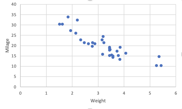
Let's represent the milage per gallon against the weight for each of the $32$ cars.
Using Matplotlib defaults
# Reset to Matplotlib defaults
sns.reset_orig()
# Create figure and axis
fig, ax = plt.subplots()
# Draw points
ax.scatter(df.wt, df.mpg)
# Set axis labels
ax.set_xlabel("weight")
ax.set_ylabel("milage");

Using R defaults
Using Matlab defaults
Using Excel defaults
Using Numbers (MacOS) defaults
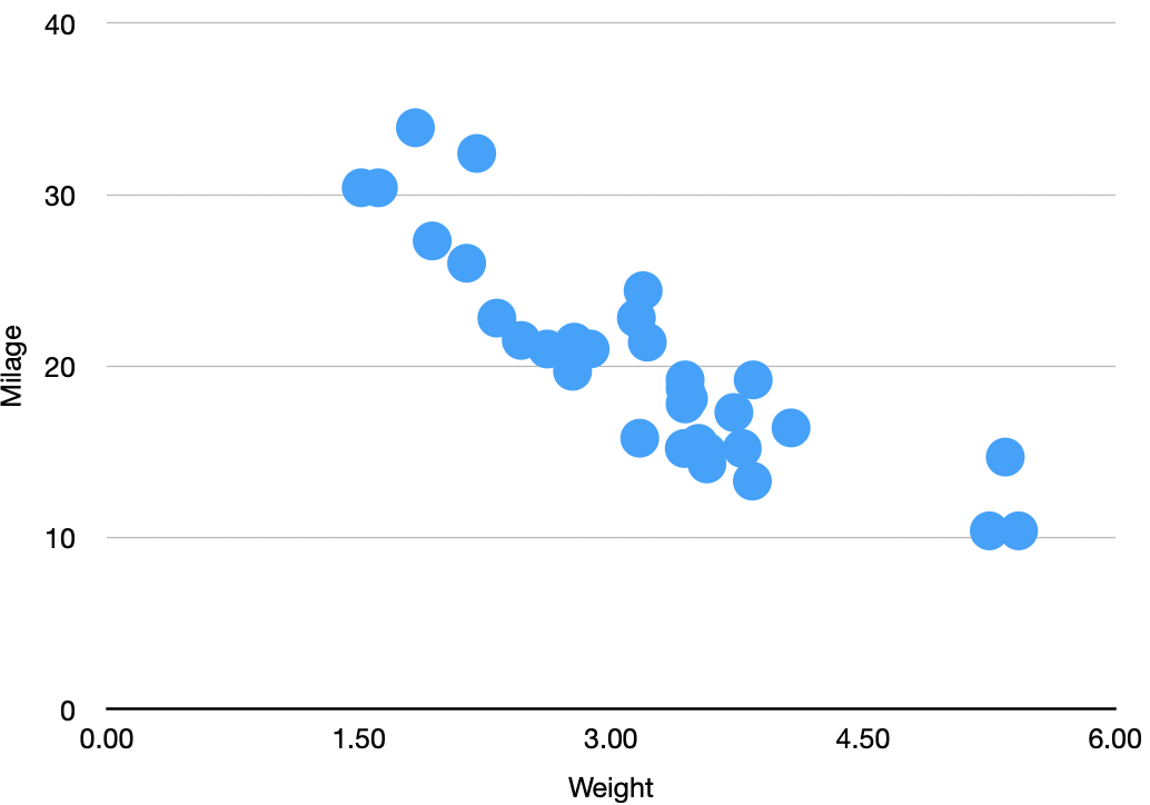
Using Seaborn defaults
# Reset to Matplotlib defaults
sns.reset_orig()
# Create figure and axis
fig, ax = plt.subplots()
# Draw points using 'sns.scatterplot' instead of 'ax.scatter'
sns.scatterplot(data=df, x="wt", y="mpg", ax=ax)
# Set axis labels
ax.set_xlabel("weight")
ax.set_ylabel("milage");

However, Seaborn propose several defaults. The more default of the defaults is by calling
sns.set()
# Using Seaborn global defaults
sns.set()
# Create figure and axis
fig, ax = plt.subplots()
# Draw points
sns.scatterplot(data=df, x="wt", y="mpg", ax=ax)
# Set axis labels
ax.set_xlabel("weight")
ax.set_ylabel("milage");

Other 'defaults' can be set by using sns.set_theme, choosing a context (default is "notebook", alternatives are "paper", "talk", and "poster"), and a style (default is "darkgrid", alternatives are "whitegrid", "dark", "white", "ticks").
# Setting the Searborn 'theme'
sns.set_theme(context="notebook", style='whitegrid')
# Create figure and axis
fig, ax = plt.subplots()
# Draw dots
sns.scatterplot(data=df, x="wt", y="mpg", ax=ax)
# Set axis labels
ax.set_xlabel("weight")
ax.set_ylabel("milage");

# Setting the Searborn 'theme'
sns.set_theme(context="notebook", style='white')
# Create figure and axis
fig, ax = plt.subplots()
# Draw dots
sns.scatterplot(data=df, x="wt", y="mpg", ax=ax)
# Set axis labels
ax.set_xlabel("weight")
ax.set_ylabel("milage");

Do NOT ignore saliency effects
...or pop-out effects
Here are a few examples from Collin Ware's book Visual Thinking for Design, accessible here.
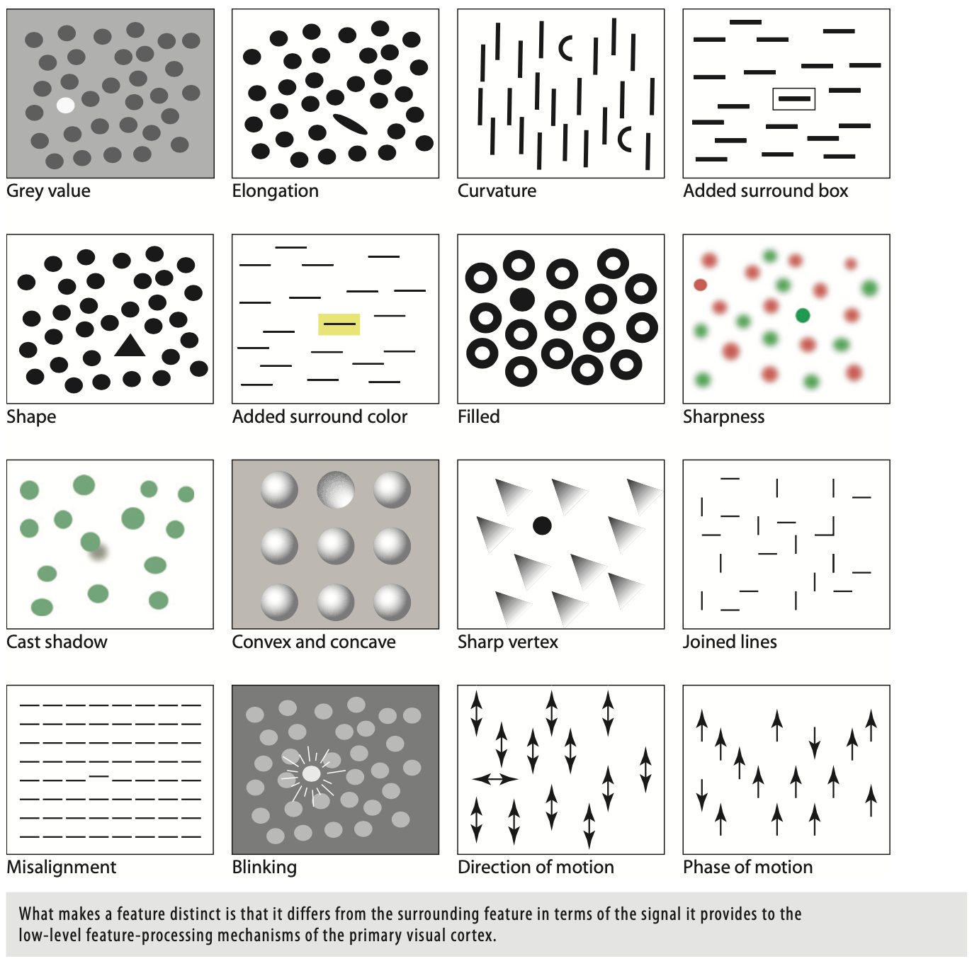

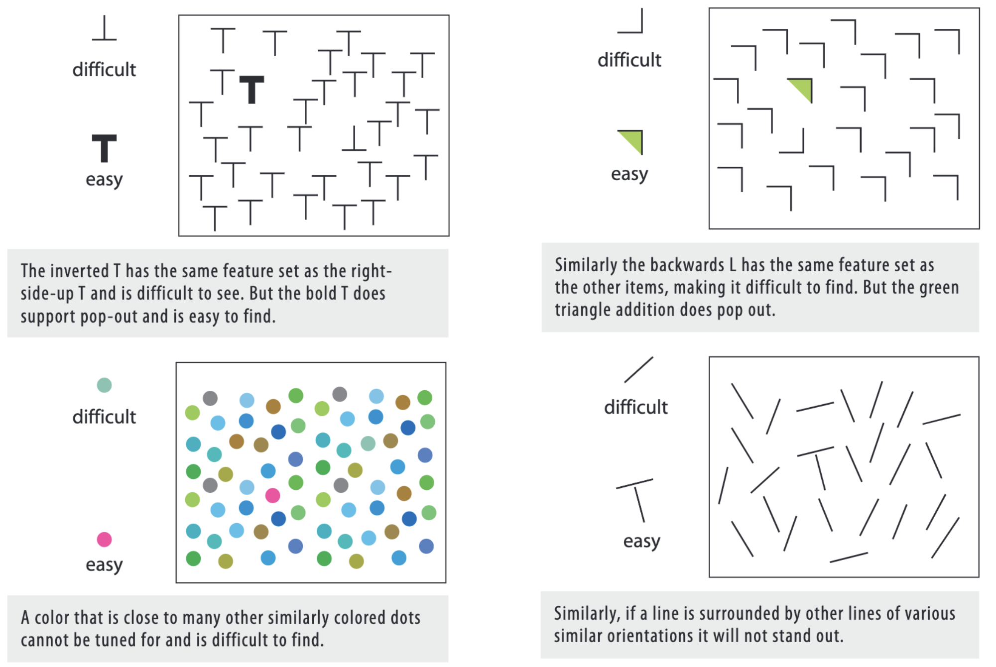
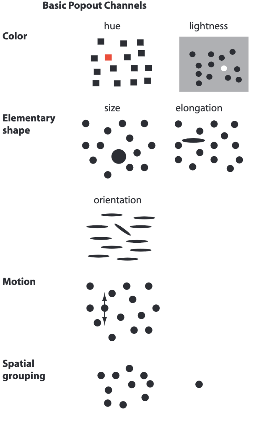
This can be used to data visualization (example also from Visual thinking for design):
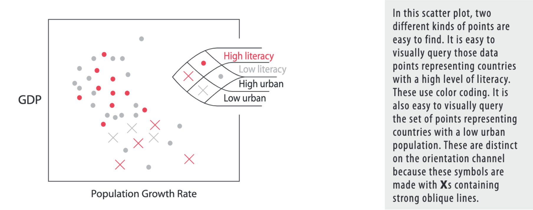
Example: smoker tips
This is dataset from the Seaborn's library.
We will look at the tips given at restaurant/café, depending whether or not the client is a smoker or not.

Load data 
tips = sns.load_dataset("tips")
tips
Visualization 1 
sns.relplot(x="total_bill", y="tip", data=tips, hue="smoker");

Visualization 2 
sns.relplot(x="total_bill", y="tip", hue="smoker", style="smoker",
data=tips);

In Visualization 2, compared to Visualization 1, the two groups are more easy to distinguish as two features change instead of one.
Play with transparency and width of the objects
Abstract example: Scatter plot
Generate data 
np.random.seed(123)
x = np.random.normal(0, 1, size=500)
y = x + np.random.normal(0, 0.5, size=500)
Visualization 1 
Plot function 
def make_plot():
# Use nice Seaborn defaults
sns.set_theme(context="notebook", style="white")
# Create figure and axis
fig, ax = plt.subplots(figsize=(8, 6))
# Draw dots
ax.scatter(x, y, s=100)
plt.show()
Show plot 
make_plot()

Visualization 2 
Plot function 
def make_plot():
# Use nice Seaborn defaults
sns.set_theme(context="notebook", style="white")
# Create figure and axis
fig, ax = plt.subplots(figsize=(8, 6))
# Draw dots
ax.scatter(x, y, alpha=0.5, s=100)
plt.show()
Show plot 
make_plot()

Visualization 2 makes it easier to see each individual point, and gives a better grasp of the density.
Time series example: Brownian motion
Example inspired from this blog post about Gaussian processes.
We will generate as example a Brownian motion (random motion of particles suspended in a fluid). It doesn't matter for our purpose what Brownian motion is, we can just consider what follows as a generic time series example.
Generate data 
This is not important for our purpose to understand what Brownian motion is, but if you want to know a little more about it, here is part of the blog post introduction about Brownian motion:
An example of a stochastic process that you might have come across is the model of Brownian motion (also known as Wiener process ). Brownian motion is the random motion of particles suspended in a fluid. It can be seen as a continuous random walk where a particle moves around in the fluid due to other particles randomly bumping into it. We can simulate this process over time $t$ in 1 dimension $d$ by starting out at position 0 and moving the particle over a certain amount of time $\Delta t$ with a random distance $\Delta d$ from the previous position. The random distance is sampled from a normal distribution with mean $0$ and variance $\Delta t$. Sampling $\Delta d$ from this normal distribution is noted as $\Delta d \sim \mathcal{N}(0, \Delta t)$. The position $d(t)$ at time $t$ evolves as $d(t + \Delta t) = d(t) + \Delta d$.
# 1D simulation of the Brownian motion process
total_time = 1
nb_steps = 75
delta_t = total_time / nb_steps
nb_processes = 10 # Simulate different motions
mean = 0. # Mean of each movement
stdev = np.sqrt(delta_t) # Standard deviation of each movement
np.random.seed(123) # Seed the random number generator
# Create x-coordinates
X = np.arange(0, total_time, delta_t)
# Simulate the brownian motions in a 1D space by cumulatively
# making a new movement delta_d
Y = np.cumsum(
# Move randomly from current location to N(0, delta_t)
np.random.normal(
mean, stdev, (nb_processes, nb_steps)),
axis=1)
# Put everything in a dataframe for having a nice view
data = np.concatenate((np.atleast_2d(X), Y), axis=0).T
columns = ["X", ] + [f"Series{i}" for i in range(nb_processes) ]
df = pd.DataFrame(data=data, columns=columns)
df
Visualization 1 
Plot function 
def make_plot_1():
# Use nice Seaborn defaults
sns.set_theme(context="notebook", style="white")
# Create figure and axis
fig, ax = plt.subplots(figsize=(8, 5))
# Make lines
for i in range(nb_processes):
ax.plot(X, Y[i], label=f"Series {i}")
# Draw mean
ax.plot(X, Y.mean(axis=0), label="Mean")
# Set axis labels
ax.set_xlabel("time")
ax.set_ylabel("position")
# Display legend
plt.legend()
plt.show()
Show plot 
make_plot_1()

Visualization 2 
Plot function 
def make_plot_2():
# Use nice Seaborn defaults
sns.set_theme(context="notebook", style="white")
# Create figure and axis
fig, ax = plt.subplots(figsize=(8, 5))
# Make lines
for i in range(nb_processes):
ax.plot(X, Y[i], color='.5')
# Draw mean
ax.plot(X, Y.mean(axis=0), label="Mean", color="black")
# Set axis labels
ax.set_xlabel("time")
ax.set_ylabel("position")
# Set axis limits
ax.set_xlim(0, 1)
# Display legend
plt.legend()
plt.show()
Show plot 
make_plot_2()

Visualization 3 
Plot function 
def make_plot_3():
# Use nice Seaborn defaults
sns.set_theme(context="notebook", style="white")
# Create figure and axis
fig, ax = plt.subplots(figsize=(8, 5))
# Make lines
for i in range(nb_processes):
ax.plot(X, Y[i], c='.5', lw=.5, zorder=-10)
# Draw mean
ax.plot(X, Y.mean(axis=0), c="black", lw=2, label="Mean")
# Set axis labels
ax.set_xlabel("time")
ax.set_ylabel("position")
# Set axis limits
ax.set_xlim(0, 1)
# Display legend
plt.legend()
plt.show()
Show plot 
make_plot_3()

Look at the difference between Visualization 1, 2, and 3. Only things that we change is the line width, and the color.
Visualization 4 
What happens if I need to see individual paths? Then, keeping the colors can be a good idea.
Plot function 
def make_plot_4():
# Use nice Seaborn defaults
sns.set_theme(context="notebook", style="white")
# Create figure and axis
fig, ax = plt.subplots(figsize=(8, 5))
# Make lines
for i in range(nb_processes):
ax.plot(X, Y[i], lw=.5, zorder=-10, label=f"Series {i}")
# Draw mean
ax.plot(X, Y.mean(axis=0), c="black", lw=2, label="mean")
# Set axis labels
ax.set_xlabel("time")
ax.set_ylabel("position")
# Set axis limits
ax.set_xlim(0, 1)
# Display legend
plt.legend()
plt.show()
Show plot 
make_plot_4()

Do NOT overload your figures
Example: Time series
Case adapted from Rougier et al. (2014) (see GitHub repo).
Generate data 
# Seed the random number generator
np.random.seed(0)
# Generate data
p, n = 7, 32
X = np.linspace(0,2,n)
Y = np.random.uniform(-.75,.5,(p,n))
# Put the data in a dataframe to have a nice display
data = np.concatenate((np.atleast_2d(X), Y), axis=0).T
columns = ["X", ] + [f"Y{i+1}" for i in range(p) ]
df = pd.DataFrame(data=data, columns=columns)
df
Visualization 1 
Plot function 
def make_plot_1():
# Reset to Maplotlib defaults
sns.reset_defaults()
# Create figure and axis
fig, ax = plt.subplots(figsize=(12,6))
# Make it square
ax.set_aspect(1)
# Add a wonderful yellow background color
ax.patch.set_facecolor((1,1,.75))
# Make lines
for i in range(p):
plt.plot(X, Y[i], label=f"Series {1+i}", lw=2)
# Set axis limits
ax.set_xlim( 0,2)
ax.set_ylim(-1,1)
# Add (a lot of) ticks
ax.set_yticks(np.linspace(-1,1,18))
ax.set_xticks(np.linspace(0,2,18))
# Add legend
ax.legend()
# Add grid
ax.grid()
plt.show()
Show plot 
make_plot_1()

Visualization 2 
Plot function 
def make_plot_2():
# Reset to Maplotlib defaults
sns.reset_defaults()
# Create figure and axis
fig, ax = plt.subplots(figsize=(14,6))
# Make it square
ax.set_aspect(1)
# Define coordinates
Yy = p-(np.arange(p)+0.5)
Xx = [p,]*p
# Create grey background
rects = ax.barh(Yy, Xx, align='center', height=0.75, color='.95', ec='None', zorder=-20)
# Set axis limits
ax.set_xlim(0,p)
ax.set_ylim(0,p)
for i in range(p):
# Put label
plt.text(-.1, Yy[i], s=f"Series {1+i}", ha = "right", fontsize=16)
# Add vertical lines
ax.axvline(0, (Yy[i]-.4)/p, (Yy[i]+.4)/p, c='k', lw=3)
ax.axvline(.25*p, (Yy[i]-.375)/p, (Yy[i]+.375)/p, c='.5', lw=.5, zorder=-15)
ax.axvline(.50*p, (Yy[i]-.375)/p, (Yy[i]+.375)/p, c='.5', lw=.5, zorder=-15)
ax.axvline(.75*p, (Yy[i]-.375)/p, (Yy[i]+.375)/p, c='.5', lw=.5, zorder=-15)
# Make lines
for j in range(p):
if i != j:
ax.plot(X*p/2, i+.5+2*Y[j]/p, c='.5', lw=.5, zorder=-10)
else:
ax.plot(X*p/2, i+.5+2*Y[i]/p, c='k', lw=2)
# Add manually text labels
plt.text(.25*p, 0, "0.5", va = "top", ha="center", fontsize=10)
plt.text(.50*p, 0, "1.0", va = "top", ha="center", fontsize=10)
plt.text(.75*p, 0, "1.5", va = "top", ha="center", fontsize=10)
# Remove axis
plt.axis('off')
plt.show()
Show plot 
make_plot_2()

Here a (non exhaustive) list of the changes to make the figure more light:
- Separate the plot of each series (this is without a doubt the most important)
- Remove the ugly background and put instead a very light 4-square grid
- Hide the x-ticks (since there is the grid, they are not necessary)
- Only put a few values on the x-axis
- Remove the y-axis
- Play with line width and transparency (more on this next section)
- Use a bichromatic palette (two colors only)
- Remove the legend and annotate directly the figure (this can be costly in terms of time to implement)
(Bold font indicates the changes I found the most important to improve the readability.)
Going step by step
Let's continue with the same example but proceed step by step.
Initial
Plot function 
def make_plot():
# Reset to Maplotlib defaults
sns.reset_defaults()
# Create figure and axis
fig, ax = plt.subplots(figsize=(6,4))
# Add a wonderful yellow background color
ax.patch.set_facecolor((1,1,.75))
# Make lines
for i in range(p):
ax.plot(X, Y[i], label=f"Series {1+i}", lw=2)
# Set axis limits
ax.set_xlim( 0,2)
ax.set_ylim(-1,1)
# Add (a lot of) ticks
ax.set_yticks(np.linspace(-1,1,18))
ax.set_xticks(np.linspace(0,2,18))
# Add legend
ax.legend()
# Add grid
ax.grid()
Show plot 
make_plot()

This figure is on purpose overloaded, so let's take a fresh start.
Come back to defaults
Here is what we will obtain using the default options...
Plot function 
def make_plot():
# Reset to Maplotlib defaults
sns.reset_defaults()
# Create figure and axis
fig, ax = plt.subplots(figsize=(6,4))
# Make lines
for i in range(p):
ax.plot(X, Y[i], label=f"Series {1+i}", lw=2)
# Add legend
ax.legend()
plt.show()
Show plot 
make_plot()

Let's now go step by step. Le's begin with moving the legend out.
Move the legend outside
Plot function 
def make_plot():
# Reset to Maplotlib defaults
sns.reset_defaults()
# Create figure and axis
fig, ax = plt.subplots(figsize=(6,4))
# Make lines
for i in range(p):
ax.plot(X, Y[i], label=f"Series {1+i}", lw=2)
# Add legend
fig.legend(loc="center", bbox_to_anchor=(1., 0.5), bbox_transform=fig.transFigure)
plt.show()
Show plot 
make_plot()

With the legend outside, it is better, but all the series are on top of each other. Let's fix that.
Separate the plots
Plot function 
def make_plot():
# Reset to Maplotlib defaults
sns.reset_defaults()
# Create figure and axis
fig, axes = plt.subplots(figsize=(6,8), nrows=p)
# Make lines
for i in range(p):
ax = axes[i]
ax.plot(X, Y[i], label=f"Series {1+i}", lw=2, color=f"C{i}")
# Add legend
fig.legend(loc="center", bbox_to_anchor=(1.05, 0.5), bbox_transform=fig.transFigure)
plt.show()
Show plot 
make_plot()

Troubles happened! Using defaults, there is a lot of overlapping. Let's fix that.
Avoid overlapping
Plot function 
def make_plot():
# Reset to Maplotlib defaults
sns.reset_defaults()
# Create figure and axis
fig, axes = plt.subplots(figsize=(6,8), nrows=p)
# Make lines
for i in range(p):
ax = axes[i]
ax.plot(X, Y[i], label=f"Series {1+i}", lw=2, color=f"C{i}")
# Add legend -- We slightly move the legend box to the right
fig.legend(loc="center", bbox_to_anchor=(1.1, 0.5), bbox_transform=fig.transFigure)
# Avoid overlapping
fig.tight_layout()
plt.show()
Show plot 
make_plot()

Way to much ticks and useless numbers, let's remove them.
Remove the unnecessary ticks
Plot function 
def make_plot():
# Reset to Maplotlib defaults
sns.reset_defaults()
# Create figure and axis
fig, axes = plt.subplots(figsize=(6,8), nrows=p)
# Make lines
for i in range(p):
ax = axes[i]
ax.plot(X, Y[i], label=f"Series {1+i}", lw=2, color=f"C{i}")
# Add ticks
ax.set_yticks([-0.5, 0.5])
ax.set_xticks([])
ax.set_xticks([0.5, 1.0, 1.5])
if i < len(Y) - 1:
ax.set_xticklabels(["", "", ""])
# Add legend -- We slightly move the legend box to the right
fig.legend(loc="center", bbox_to_anchor=(1.1, 0.5), bbox_transform=fig.transFigure)
# Avoid overlapping
fig.tight_layout()
plt.show()
Show plot 
make_plot()

There is a lot of useless white margins, and the y-axis limits are not exactly the same, which can induce biases in the interpretation. There is an easy fix: set limits for the axis.
Set axis limits
Plot function 
def make_plot():
# Reset to Maplotlib defaults
sns.reset_defaults()
# Create figure and axis
fig, axes = plt.subplots(figsize=(6,8), nrows=p)
# Make lines
for i in range(p):
ax = axes[i]
ax.plot(X, Y[i], label=f"Series {1+i}", lw=2, color=f"C{i}")
# Add ticks
ax.set_yticks([-0.5, 0.5])
ax.set_xticks([])
ax.set_xticks([0.5, 1.0, 1.5])
if i < len(Y) - 1:
ax.set_xticklabels(["", "", ""])
# Set axis limits
ax.set_xlim(0,2)
ax.set_ylim(-0.75, 0.75)
# Add legend -- We slightly move the legend box to the right
fig.legend(loc="center", bbox_to_anchor=(1.1, 0.5), bbox_transform=fig.transFigure)
# Avoid overlapping
fig.tight_layout()
plt.show()
Show plot 
make_plot()

We're going in the right direction, but by separating the plot of each series, it is now difficult to compare them. Let's try to add each other series in the background.
Plot the other series for easy comparison
Plot function 
def make_plot():
# Reset to Maplotlib defaults
sns.reset_defaults()
# Create figure and axis
fig, axes = plt.subplots(figsize=(6,8), nrows=p)
# Make lines
for i in range(p):
ax = axes[i]
ax.plot(X, Y[i], label=f"Series {1+i}", lw=2, color=f"C{i}")
# Plot other series
for j in range(p):
if j != i:
ax.plot(X, Y[j], lw=0.5, color=f"C{j}")
# Add ticks
ax.set_yticks([-0.5, 0.5])
ax.set_xticks([])
ax.set_xticks([0.5, 1.0, 1.5])
if i < len(Y) - 1:
ax.set_xticklabels(["", "", ""])
# Set axis limits
ax.set_xlim(0,2)
ax.set_ylim(-0.75, 0.75)
# Add legend -- We slightly move the legend box to the right
fig.legend(loc="center", bbox_to_anchor=(1.1, 0.5), bbox_transform=fig.transFigure)
# Avoid overlapping
fig.tight_layout()
plt.show()
Show plot 
make_plot()

Even playing with the thickness of the lines, this figure is really hard to read. Let's try to do better.
Adapt visualization of other series
Plot function 
def make_plot():
# Reset to Maplotlib defaults
sns.reset_defaults()
# Create figure and axis
fig, axes = plt.subplots(figsize=(6,8), nrows=p)
# Make lines
for i in range(p):
ax = axes[i]
ax.plot(X, Y[i], label=f"Series {1+i}", lw=2, color=f"C{i}")
# Plot other series
for j in range(p):
if j != i:
ax.plot(X, Y[j], lw=0.2, color="0.5", zorder=-10)
# Add ticks
ax.set_yticks([-0.5, 0.5])
ax.set_xticks([])
ax.set_xticks([0.5, 1.0, 1.5])
if i < len(Y) - 1:
ax.set_xticklabels(["", "", ""])
# Set axis limits
ax.set_xlim(0,2)
ax.set_ylim(-0.75, 0.75)
# Add legend -- We slightly move the legend box to the right
fig.legend(loc="center", bbox_to_anchor=(1.1, 0.5), bbox_transform=fig.transFigure)
# Avoid overlapping
fig.tight_layout()
plt.show()
Show plot 
make_plot()

It is already better, but it is still not very satisfying. Let's try to pimp our figure a little bit more.
Put a grid
Plot function 
def make_plot():
# Reset to Maplotlib defaults
sns.reset_defaults()
# Create figure and axis
fig, axes = plt.subplots(figsize=(6,8), nrows=p)
# Make lines
for i in range(p):
ax = axes[i]
ax.plot(X, Y[i], label=f"Series {1+i}", color=f"C{i}", lw=2)
# Plot other series
for j in range(p):
if j != i:
ax.plot(X, Y[j], lw=0.2, color="0.5", zorder=-10)
# Set axis limits
ax.set_xlim( 0,2)
ax.set_ylim(-1,1)
# Add ticks
ax.set_yticks([-0.5, 0.5 ])
ax.set_xticks([])
ax.set_xticks([0.5, 1.0, 1.5])
# Remove ticks marks
ax.tick_params(axis="x", length=0)
if i < len(Y) - 1:
ax.set_xticklabels(["", "", ""])
# Set axis limits
ax.set_xlim(0,2)
ax.set_ylim(-0.75, 0.75)
# Put grid
ax.grid(axis="x");
# Add legend
fig.legend(loc="center", bbox_to_anchor=(1.05, 0.5), bbox_transform=fig.transFigure)
plt.show()
Show plot 
make_plot()

The grid is not easy to see and it creates confusion with the series in the background. Let's try to improve that...
Improve grid aspect
To do that, we will also change the axis appearance.
Plot function 
def make_plot():
# Reset to Maplotlib defaults
sns.reset_defaults()
# Create figure and axis
fig, axes = plt.subplots(figsize=(6,8), nrows=p)
# Make lines
for i in range(p):
ax = axes[i]
ax.plot(X, Y[i], label=f"Series {1+i}", color=f"C{i}", lw=2)
# Plot other series
for j in range(p):
if j != i:
ax.plot(X, Y[j], lw=0.2, color="0.5", zorder=-10)
# Set axis limits
ax.set_xlim( 0,2)
ax.set_ylim(-1,1)
# Add ticks
ax.set_yticks([-0.5, 0.5 ])
ax.set_xticks([])
ax.set_xticks([0.5, 1.0, 1.5])
# Remove ticks marks
ax.tick_params(axis="x", length=0)
if i < len(Y) - 1:
ax.set_xticklabels(["", "", ""])
# Set axis limits
ax.set_xlim(0,2)
ax.set_ylim(-0.75, 0.75)
# Put grid
ax.set_facecolor("0.95")
ax.grid(color="k", axis="x", zorder=-100)
# Change the axis appearance
for axis in ['top','bottom', 'right']:
ax.spines[axis].set_linewidth(0.)
for axis in ['left']:
ax.spines[axis].set_linewidth(2.)
# Add legend
fig.legend(loc="center", bbox_to_anchor=(1.05, 0.5), bbox_transform=fig.transFigure)
plt.show()
Show plot 
make_plot()

At this stage, I think we already have something more than acceptable. Just for the sake of the demonstration, let's still continue a little bit...
Remove the legend and put annotate the figure instead
Plot function 
def make_plot():
# Reset to Maplotlib defaults
sns.reset_defaults()
# Create figure and axis
fig, axes = plt.subplots(figsize=(6,8), nrows=p)
# Make lines
for i in range(p):
ax = axes[i]
ax.plot(X, Y[i], color=f"C{i}", lw=2)
# Plot other series
for j in range(p):
if j != i:
ax.plot(X, Y[j], lw=0.2, color="0.5", zorder=-10)
# Put labels
ax.set_ylabel(f"Series {1+i}", rotation=0, labelpad=30, verticalalignment="center")
# Set axis limits
ax.set_xlim( 0,2)
ax.set_ylim(-1,1)
# Custom y-ticks
ax.set_yticks([])
# ax.set_yticks([-0.5, 0.5])
# ax.yaxis.tick_right()
# Custom x-ticks
ax.set_xticks([])
ax.set_xticks([0.5, 1.0, 1.5])
# Remove ticks marks
ax.tick_params(axis="x", length=0)
if i < len(Y) - 1:
ax.set_xticklabels(["", "", ""])
# Set axis limits
ax.set_xlim(0,2)
ax.set_ylim(-0.75, 0.75)
# Put grid
ax.set_facecolor("0.95")
ax.grid(color="k", axis="x", zorder=-100)
# Change the axis appearance
for axis in ['top','bottom', 'right']:
ax.spines[axis].set_linewidth(0.)
for axis in ['left']:
ax.spines[axis].set_linewidth(2.)
plt.show()
Show plot 
make_plot()

Note that in the same time I put the labels "Series 1", "Series 2", etc., I also removed the y-ticks. The fact to remove the ticks could be a very poor design choice depending on the context. Don't forget what message you want to transmit!
Make it bichromatic
Plot function 
def make_plot():
# Reset to Maplotlib defaults
sns.reset_defaults()
# Create figure and axis
fig, axes = plt.subplots(figsize=(6,8), nrows=p)
# Make lines
for i in range(p):
ax = axes[i]
ax.plot(X, Y[i], color="0", lw=2)
# Plot other series
for j in range(p):
if j != i:
ax.plot(X, Y[j], lw=0.2, color="0.5", zorder=-10)
# Put labels
ax.set_ylabel(f"Series {1+i}", rotation=0, labelpad=30, verticalalignment="center")
# Set axis limits
ax.set_xlim( 0,2)
ax.set_ylim(-1,1)
# Custom y-ticks
ax.set_yticks([])
# ax.set_yticks([-0.5, 0.5])
# ax.yaxis.tick_right()
# Custom x-ticks
ax.set_xticks([])
ax.set_xticks([0.5, 1.0, 1.5])
# Remove ticks marks
ax.tick_params(axis="x", length=0)
if i < len(Y) - 1:
ax.set_xticklabels(["", "", ""])
# Set axis limits
ax.set_xlim(0,2)
ax.set_ylim(-0.75, 0.75)
# Put grid
ax.set_facecolor("0.95")
ax.grid(color="k", axis="x", zorder=-100)
# Change the axis appearance
for axis in ['top','bottom', 'right']:
ax.spines[axis].set_linewidth(0.)
for axis in ['left']:
ax.spines[axis].set_linewidth(2.)
plt.show()
Show plot 
make_plot()

The relevance of this last step could be subject to discussion, as it may impair the easiness of comparing the different processes.
Pay attention to colors
A few words on the color wheel
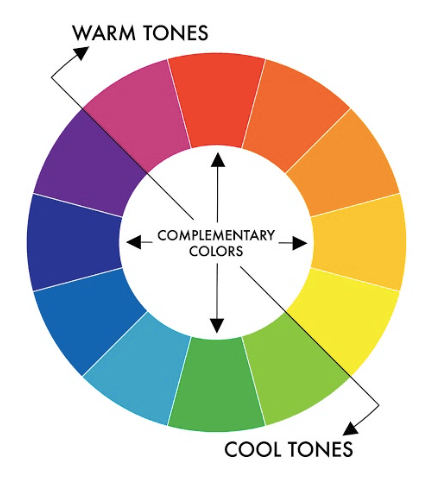
If using only two colors, complementary colors can be a good idea:

The way Matplotlib revises the default color palette when launching the version 2.0 (2017) is a consequence of taking into in consideration the relations between colors. See:
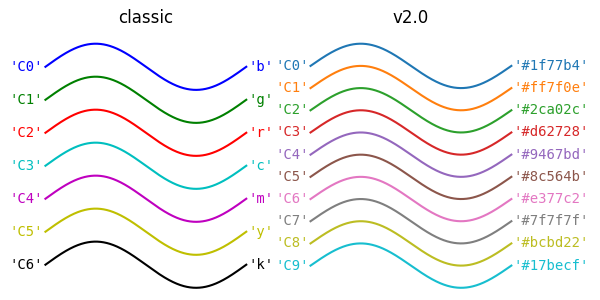
This not only offers better aesthetics, but also a better readability.
Colormap examples
Example: Elevation, MRI scan, pyramid, and periodic function
Examples adapted from this blog post (GitHub Repo).
Generate / load data 
# Load hillshading and return elevation
with np.load('data_lec4/jacksboro_fault_dem.npz') as dem:
elevation = dem["elevation"]
pd.DataFrame(elevation)
# Load image of a medical scan
with gzip.open('data_lec4/s1045.ima.gz') as dfile:
scan_im = np.frombuffer(dfile.read(), np.uint16).reshape((256, 256))
pd.DataFrame(scan_im)
def pyramid(n=513):
"""Create a pyramid function"""
s = np.linspace(-1.0, 1.0, n)
x, y = np.meshgrid(s, s)
z = 1.0 - np.maximum(abs(x), abs(y))
return x, y, z
pyramid_data = pyramid()
x, y, z = pyramid_data
pd.DataFrame(x)
def periodic_fn():
"""Create a periodic function with a step function"""
dx = dy = 0.05
y, x = np.mgrid[-5: 5 + dy: dy, -5: 10 + dx: dx]
z = np.sin(x) ** 10 + np.cos(10 + y * x) + np.cos(x) + 0.2 * y + 0.1 * x + \
np.heaviside(x, 1) * np.heaviside(y, 1)
z = z - np.mean(z)
return x, y, z
periodic_fn_data = periodic_fn()
x, y, z = periodic_fn_data
pd.DataFrame(x)
Visualize data 
Plot function 
def plot_examples(color_map, images):
"""Create the figure based on the provided images, continuous colormaps"""
# Define number of rows and columns
nrows, ncols = 1, len(images)
# Create the figure
fig = plt.figure(figsize=(15, 4), facecolor="white")
# Init axis index
axi = 1
# Loop over all images
for name, im in images.items():
# Trick to identify 3D datasets
if len(im) == 3:
# Draw 3D projection
px, py, pz = im
ax = fig.add_subplot(nrows, ncols, axi, projection="3d", elev=10, azim=-45)
ax.plot_surface(px, py, pz, cmap=color_map, linewidth=0, antialiased=False)
# Remove ticks
ax.set_xticks([])
ax.set_yticks([])
ax.set_zticks([])
else:
# Draw 2D plot
ax = fig.add_subplot(nrows, ncols, axi)
ax.imshow(im, cmap=color_map, aspect="auto")
# Remove axis
ax.axis("off")
# Make it square
ax.set_aspect(1)
# Put name
ax.set_title(name)
# Increment axis index
axi += 1
# Put a tilte to the figure
fig.suptitle(color_map, fontsize=24)
# Remove most of the white parts
fig.tight_layout()
return fig
Show plot 
images = {
"hill": elevation,
"scan": scan_im,
"pyramid": pyramid_data,
"pyramid\n(view from top)": pyramid_data[-1],
"periodic function": periodic_fn_data,
"periodic function\n(view from top)": periodic_fn_data[-1]}
for color_map in ("jet", "gray", "viridis",):
fig = plot_examples(color_map=color_map,
images=images)


Note that, even familiar, the jet colormap is not perceptually uniform, and should be avoided in the contexts depicted here. The gray colormap doesn't have this problem, but some details are more easily "hidden". The viridis colormap does a better job here.
Redundancy is good!
Abstract example: Histogram vs barplot
Generate data 
# Seed the random number generator
np.random.seed(4)
# Set the parameters
mean_1 = 150.0
mean_2 = 200.0
sigma_1 = 10.0
sigma_2 = 50.0
n = 100
# Create the samples
x1 = np.random.normal(mean_1, scale=sigma_1, size=n)
x2 = np.random.normal(mean_2, scale=sigma_2, size=n)
df = pd.DataFrame({"x1": x1, "x2": x2})
df
Visualize data 
Plot function 
def make_plot():
sns.set_theme(context="notebook", style="white")
# Create figure and axes
fig, axes = plt.subplots(ncols=2, figsize=(12, 4))
# Create histogram
ax = axes[0]
sns.histplot(data=df, ax=ax, element="step", stat="density")
ax.set_xlabel("value")
# Create a barplot
ax = axes[1]
df_melted = df.melt()
sns.barplot(x="variable", y="value", ax=ax, data=df_melted, ci="sd")
plt.tight_layout()
plt.show()
Show plot 
make_plot()

The histograms and the bartplots give two perspectives on the data, which are complementary (the barplots summarize the information, while the histograms give a more 'detailed' view but more difficult to interpret).
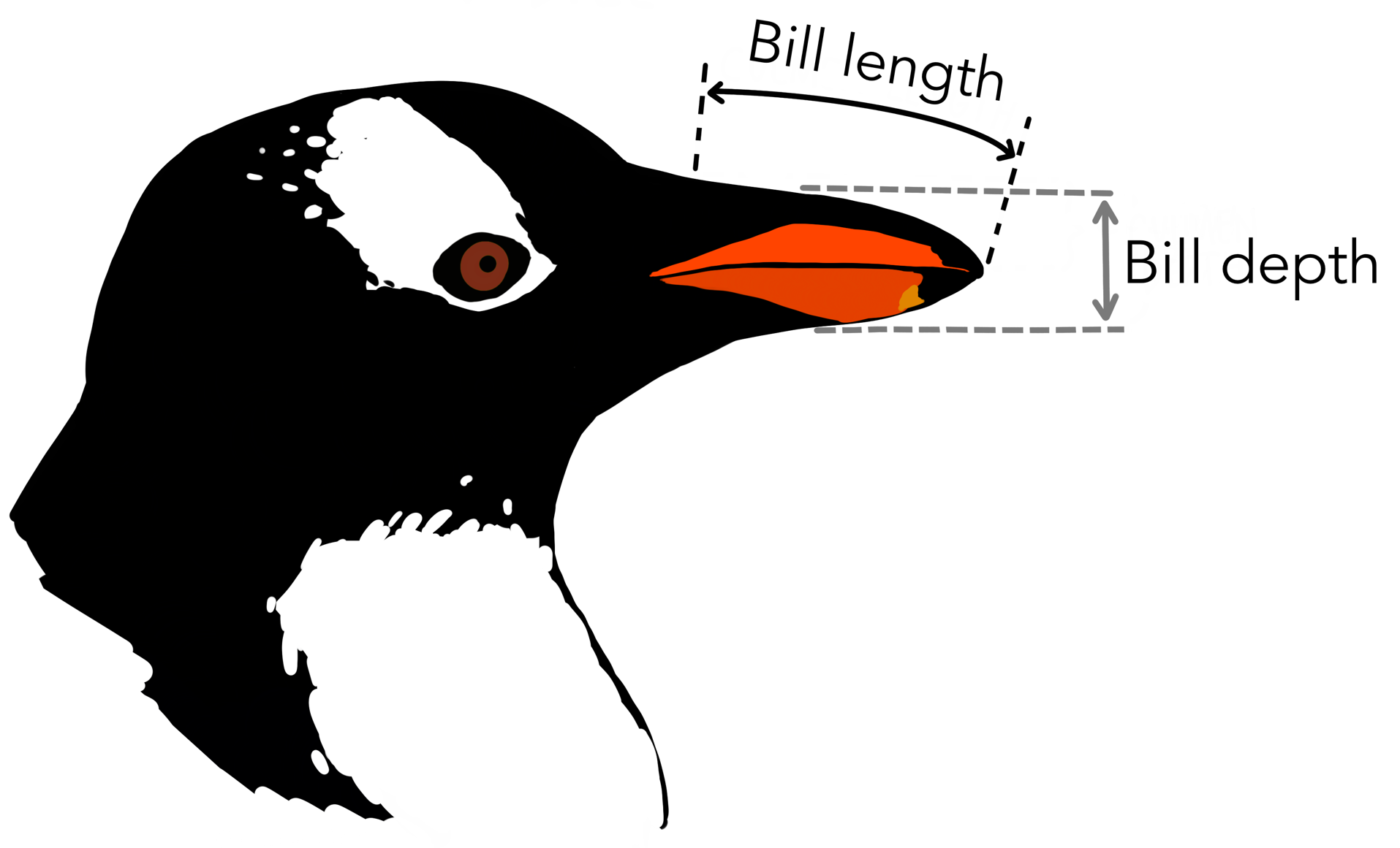
Penguins: Distribution joint plot
The examples are adapted from the Seaborn's documentation.
This dataset (coming also from Seaborn) contains several measures in penguins.
We will take a look at the bill length and depth.
Load data 
penguins = sns.load_dataset("penguins")
penguins
Visualization 1 
sns.set_theme(context="notebook", style="white")
sns.jointplot(
data=penguins,
x="bill_length_mm", y="bill_depth_mm", hue="species",
kind="kde");

Visualization 2 
Same thing as visualization 1, but using a scatterplot as the central figure.
sns.set_theme(context="notebook", style="white")
sns.jointplot(
data=penguins,
x="bill_length_mm", y="bill_depth_mm", hue="species",
kind="scatter");

Here, contrary to the other examples, Visualization 2 is not better or worse than visualization 1. Both have the advantages to offer two perspectives on the data: the relation between bill depth and length depending on the species, and the distribution of each feature separately for each specie.
Self-teaching application study
Data and figure coming from Nioche et al. (2021). Please accept my apologies for the auto-citation. My (bad) excuse is that (i) I thought it constitutes a good example for a '2 perspectives' figure, (ii) I have easy access to the code, (iii) it is a real use case.
The task consists in using a vocabulary learning application for 7 days. The experiment use a mixed design. Each day, they are two sessions, such that either:
- The algorithm to generate the items to review/learn is the base line and uses a heuristic method (Leitner system).
- The algorithm to generate the items to review/learn is one of the two versions of our own algorithm (one that we labeled 'Myopic', and the other one 'Conservative sampling').
Load data 
df = pd.read_csv("data_lec4/data_summary.csv", index_col=0)
# Select only the user that complete the task
df = df[df.n_ss_done == 14]
df
Visualize data 
Plot functions 
The code is quite long, but corresponds to what can be necessary for a "highly-tuned" figure.
def roundup(x, base=1.):
"""
Round up.
If base=1, round up to the closest integer;
if base=10, round up to the closest tens; etc.
"""
return int(math.ceil(x / base)) * base
def rounddown(x, base=1.):
"""
Round down.
If base=1, round down to the closest integer;
if base=10, round up to the closest tens; etc.
"""
return int(math.floor(x / base)) * base
def scatter_n_learnt(data, active, ticks, ax, x_label, y_label, fontsize_label):
# Select data based on condition
data = data[data.teacher_md == active]
# Select color
color = "C1" if active == "threshold" else "C2"
# Draw scatter
sns.scatterplot(data=data,
x="n_recall_leitner",
y="n_recall_act",
color=color,
alpha=0.5, s=20,
ax=ax)
# Put axis labels
ax.set_xlabel(x_label, fontsize=fontsize_label)
ax.set_ylabel(y_label, fontsize=fontsize_label)
# Plot a dashed line (identity function)
ax.plot(ticks, ticks, ls="--", color="black", alpha=0.1)
# Set only a few ticks
ax.set_xticks(ticks)
ax.set_yticks(ticks)
# Make it square
ax.set_aspect(1)
def boxplot(df, ylabel, axes, ylim, fontsize_label):
# Associate a color to each condition
color_dic = {"leitner": "C0", "threshold": "C1", "forward": "C2"}
# Change teacher names for display
teacher_names = {"forward": "Cons.\nsampling",
"leitner": "Leitner",
"threshold": "Myopic"}
for i, teacher in enumerate(('threshold', 'forward')):
# Create a "slice" in the dataframe, depending on the condition
slc = df.teacher_md == teacher
df_slc = df[slc]
# Get user names (that are used as ID),
# the number of items recalled for both conditions
user = df_slc["user"]
x = df_slc["n_recall_leitner"]
y = df_slc["n_recall_act"]
# Create a new dataframe to plot more easily
df_plot = pd.DataFrame({"user": user, "leitner": x, teacher: y})
# 'Flip' the dataframe
df_melt = df_plot.melt(id_vars=["user"],
value_vars=["leitner", teacher],
value_name=ylabel, var_name="teacher")
# Select axis
ax = axes[i]
# Set the order between the two boxplots, the colors, and the labels
order = ["leitner", teacher]
colors = [color_dic[o] for o in order]
ticklabels = [teacher_names[o] for o in order]
# Draw a pair of boxplot
sns.boxplot(data=df_melt, x="teacher", y=ylabel, ax=ax,
showfliers=False, order=order, palette=colors,
boxprops=dict(alpha=.5))
# Draw the dots and the connections between them
sns.lineplot(data=df_melt,
x="teacher", y=ylabel, hue="user", alpha=0.4,
ax=ax, legend=False, marker="o")
# Put the condition name
ax.set_xticklabels(ticklabels, fontsize=fontsize_label)
# Remove the x-axis label ("teacher")
ax.set_xlabel("")
# Put a
ax.set_ylabel(ylabel, fontsize=fontsize_label)
ax.set_ylim(ylim)
# Remove the y-label for the right pair of boxplots
axes[-1].set_ylabel("")
def make_plot():
# Find the minimum/maximum value all conditions included
min_v = min(df.n_recall_leitner.min(), df.n_recall_act.min())
max_v = max(df.n_recall_leitner.max(), df.n_recall_act.max())
# Compute y-axis limits based on rounded min/max values
y_lim = (rounddown(min_v, base=10), roundup(max_v, base=10))
# Parameters plot
fontsize_title = 18
fontsize_subtitle = 18
fontsize_label_boxplot = 14
fontsize_letter = 20
fontsize_label_scatter = 14
figsize = (5, 6)
# Create figure
fig = plt.figure(figsize=figsize)
# Create axes
gs = gridspec.GridSpec(2, 2, height_ratios=[0.6, 0.3])
axes = [fig.add_subplot(gs[i, j]) for i in range(2) for j in range(2)]
# Create left and right boxplot pairs
boxplot(df=df, axes=axes[:2],
ylabel="Learned",
ylim=y_lim,
fontsize_label=fontsize_label_boxplot)
# Create left side scatter
scatter_n_learnt(data=df,
active="threshold",
x_label="Learned\nLeitner",
y_label="Learned\nMyopic",
ax=axes[2],
ticks=y_lim,
fontsize_label=fontsize_label_scatter)
# Create right side scatter
scatter_n_learnt(data=df,
active="forward",
x_label="Learned\nLeitner",
y_label="Cons. sampling",
ax=axes[3],
ticks=y_lim,
fontsize_label=fontsize_label_scatter)
fig.tight_layout()
plt.show()
Show plot 
make_plot()

The scatter plots and the boxplots offer two perspectives on the same data, helping to understand the differences in the results between each condition.
Don't forget that text can help
Example: Trigonometric functions
Example adapted from Rougier et al. (2014) (see GitHub repo)
Generate data 
X = np.linspace(-np.pi, np.pi, 256,endpoint=True)
C, S = np.cos(X), np.sin(X)
pd.DataFrame({"X": X, "C": C, "S": S})
Visualization 1 
Plot function 
def make_plot():
# Use nice Seaborn settings
sns.set_theme(context="notebook", style="white")
# Create figure and axes
fig, ax = plt.subplots(figsize=(8,5))
# Draw lines
ax.plot(X, C, color="blue", linewidth=2.5, linestyle="-", label="cosine", zorder=-1)
ax.plot(X, S, color="red", linewidth=2.5, linestyle="-", label="sine", zorder=-1)
# Change the positions of the axis, and remove the useless ones
ax.spines['right'].set_color('none')
ax.spines['top'].set_color('none')
ax.xaxis.set_ticks_position('bottom')
ax.spines['bottom'].set_position(('data',0))
ax.yaxis.set_ticks_position('left')
ax.spines['left'].set_position(('data',0))
plt.show()
Show plot 
make_plot()

Visualization 2 
Plot function 
def make_plot():
# Use nice Seaborn settings
sns.set_theme(context="notebook", style="white")
# Create figure and axes
fig, ax = plt.subplots(figsize=(8,5))
# Draw lines
ax.plot(X, C, color="blue", linewidth=2.5, linestyle="-", label="cosine", zorder=-1)
ax.plot(X, S, color="red", linewidth=2.5, linestyle="-", label="sine", zorder=-1)
# Change the positions of the axis, and remove the useless ones
ax.spines['right'].set_color('none')
ax.spines['top'].set_color('none')
ax.xaxis.set_ticks_position('bottom')
ax.spines['bottom'].set_position(('data',0))
ax.yaxis.set_ticks_position('left')
ax.spines['left'].set_position(('data',0))
# Put a legend
ax.legend(loc='upper left')
# Set x-axis limits
ax.set_xlim(X.min()*1.1, X.max()*1.1)
# Customize x-axis ticks
ax.set_xticks([-np.pi, -np.pi/2, 0, np.pi/2, np.pi])
ax.set_xticklabels([r'$-\pi$', r'$-\pi/2$', r'$0$', r'$+\pi/2$', r'$+\pi$'])
# Set y-axis limits
ax.set_ylim(C.min()*1.1,C.max()*1.1)
# Customize y-axis ticks
ax.set_yticks([-1, +1])
ax.set_yticklabels([r'$-1$', r'$+1$'])
# At t = 2pi/3...
t = 2*np.pi/3
# Draw a blue dashed line
ax.plot([t,t],[0,np.cos(t)],
color ='blue', linewidth=1.5, linestyle="--")
# Draw a blue dot
ax.scatter([t,],[np.cos(t),], 50, color ='blue')
# Create the annotation and the arrow
ax.annotate(r'$sin(\frac{2\pi}{3})=\frac{\sqrt{3}}{2}$', xy=(t, np.sin(t)), xycoords='data',
xytext=(+10, +30), textcoords='offset points', fontsize=16,
arrowprops=dict(arrowstyle="->", connectionstyle="arc3,rad=.2", color="black"))
# Draw a red dashed line
ax.plot([t,t],[0,np.sin(t)], color ='red', linewidth=1.5, linestyle="--")
# Draw a red dot
ax.scatter([t,],[np.sin(t),], 50, color ='red')
# Create the annotation and the arrow
ax.annotate(r'$cos(\frac{2\pi}{3})=-\frac{1}{2}$', xy=(t, np.cos(t)), xycoords='data',
xytext=(-90, -50), textcoords='offset points', fontsize=16,
arrowprops=dict(arrowstyle="->", connectionstyle="arc3,rad=.2", color="black"))
# Check the settings of the ticks (bigger fontsize and white background)
for label in ax.get_xticklabels() + ax.get_yticklabels():
label.set_fontsize(16)
label.set_bbox(dict(facecolor='white', edgecolor='None', alpha=0.65, zorder=1))
Show plot 
make_plot()

The text in visualization 2 helps to understand the figure and highlight particular point of interest.
Recommended reading 
Dataset 
Gapminder offers easy access to a lot of data, with a nice preview functionality.
data.world has a nice API. Price to pay is that you need to login.
import datadotworld as dw
results = dw.query(
'chhs/ca-living-wage',
'SELECT * FROM living_wage')
results_df = results.dataframe
results_df
sns.displot(results_df.livingwage);

sns.displot(results_df.livingwage, kind="kde");

sns.boxplot(data=results_df, x="livingwage");
