
ELEC-E7890 - User Research
Lecture 2 - User Study Design
Aurélien Nioche
Aalto University
Setup Python environment
# Import the libraries
import pandas as pd
import os
import seaborn as sns
import matplotlib.pyplot as plt
import numpy as np
import scipy.stats as stats

%config InlineBackend.figure_format='retina'  # Don't burn your eyes
sns.set_context("notebook")
Define a research problem & the hypothesis
Falsifiable statements
The research problem constitutes the question(s) you aim to answer.
The hypothesis constitute(s) the answer(s) to this(these) possible question(s).
For a contextualized explanation, you can refer to the Stanford Encyclopedia: Andersen, Hanne and Brian Hepburn, "Scientific Method", The Stanford Encyclopedia of Philosophy (Summer 2016 Edition), Edward N. Zalta (ed.), URL = https://plato.stanford.edu/archives/sum2016/entries/scientific-method/.
Example 1
H: "All swans are white"


Is this statement falsifiable?
Example 2
H: "Most people do not really want freedom, because freedom involves responsibility, and most people are frightened of responsibility."
Is this statement falsifiable?
To avoid 
From a more general stance:
- tautologies
- vague open-ended statements are to avoid, as they are non-falsifiable.
Note: do not cofound *working* hypothesis and *testing* hypothesis
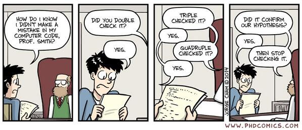
Confirmation bias while designing the study

...but even using a scientific method, we can be tempted...
Operationalize
Dependent variable vs independent variable
- Dependent variable: what we measure
- Independent variable: what we manipulate
Let's take an example...
Example 
Let's assume that I want to test the hypothesis that the gain in speed using a swipe typing keyboard is depending on the age of the user.

Several operationalizations are possible but here is one:
- Dependent variable: Word Per Minute (WPS) on a typing test.
- Independent variable: Age group (15-20, 20-25, etc.).
Note: they can be several dependant and independant variables
Baseline and control
An experiment is a comparison, so...
Why it is important? Let's take an example...
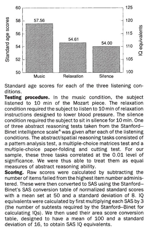
Example 
...the Mozart effect
Choose the experimental design
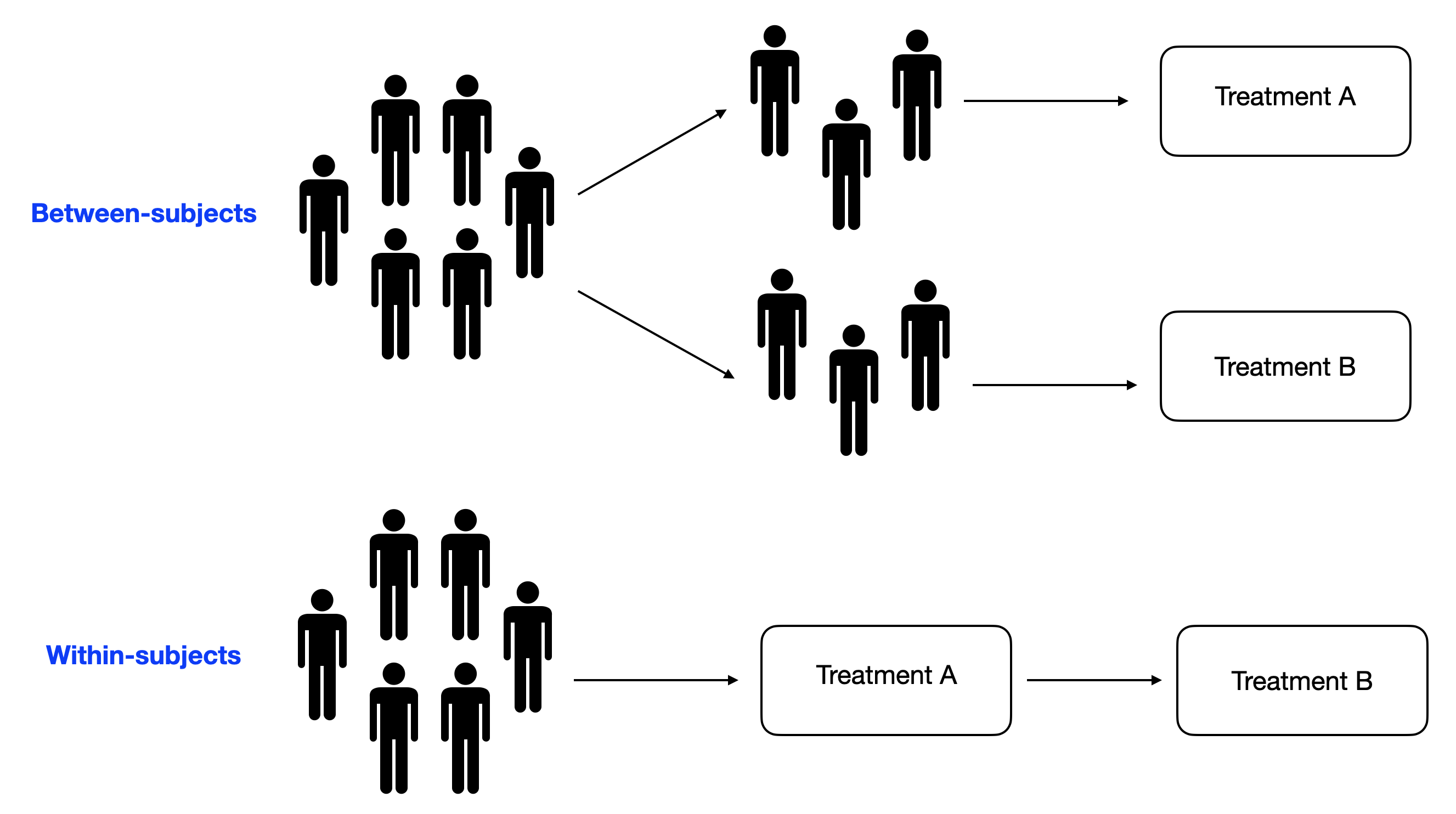
To make it short...
Do you expect large variability in your subjects?
- No: between subjects
- Yes: whithin subjects
If you choose "yes", be aware of possible counfound factors, such as the order effect
For a more in-depth comparison, see for instance Charness et al. (2012). Experimental methods: Between-subject and within-subject design. Journal of Economic Behavior & Organization.
Collect the data
Selection bias while collecting data
Even where you would not have expect them, a lot of differences can come from (arbitrary order):
- age
- gender
- cultural background / ethnicity
- education
- level of expertise of X or Y than can interfere with your experimental task
Why it is important? Let's take an example...
Example 
You should definitely look at Heinrich et al. (2010). The weirdest people in the world? Behavioral and Brain Sciences., or in a very short version Heinrich et al. (2010). Most people are not WEIRD. Nature.
What to measure
What to measure will define what you'll be able to analyze afterwards.
More about this in the 'measurement in user research' lecture!
Analyze and interpret the data
How to go from observations to interpretations to answer (or contributes to the understanding to) your research problem
Look at the raw data
Why it is important? Let's take an example...
Example 
Dataset 1 
Let's load the data from circle-data.csv
Load data 
# Load the data
df = pd.read_csv(
    os.path.join("data", "circle-data.csv"),
    index_col=[0])

# Print the top of the file
df
You could be tempted to begin to compute descriptive statistics such as mean instead of looking to your data...
# For both variables
for var in "x", "y":

    # Compute the mean and variance and print the result showing only 2 digits after the comma
    print(f"Mean '{var}': {np.mean(df[var]):.2f} +/- {np.std(df[var]):.2f} STD")
And still without looking at the raw data, let's do a barplot:
Visualize with a simple bareplot 
# Let's flip the dataframe (inverse row and columns)
df_flipped = df.melt()
# Do a barplot
sns.barplot(x="variable", y="value", data=df_flipped, ci="sd")
plt.title("Dataset 1")
plt.show()

Dataset 2 
Let's consider a second dataset...
Let's load the data from dino-data.csv
Load data 
# Load the data
df_other = pd.read_csv(
    os.path.join("data", "dino-data.csv"),
    index_col=[0])

# Look at the top of the file
df_other
# For both variables...
for var in ("x", "y"):

    # Print the means and variances for the original dataset
    print(f"Dataset 1 - Mean '{var}': {np.mean(df[var]):.1f} +/- {np.std(df[var]):.2f} STD")
print()

# For both variables...
for var in ("x", "y"):

    # Print the means and variances for the second dataset
    print(f"Dataset 2 - Mean '{var}': {np.mean(df_other[var]):.1f} +/- {np.std(df_other[var]):.2f} STD")
Visualize with a simple bareplot 
# Do a barplot
sns.barplot(x="variable", y="value", data=df_other.melt(), ci="sd")
plt.title("Dataset 2")
plt.show()

Compare by looking at the raw data 
They look quite alike, isn't it?
# Create figure and axes
fig, axes = plt.subplots(ncols=2)

# Dot the left barplot
sns.barplot(x="variable", y="value", data=df.melt(), ax=axes[0], ci="sd")
# Set the title
axes[0].set_title("Original dataset")

# Do the right barplot
sns.barplot(x="variable", y="value", data=df_other.melt(), ax=axes[1], ci="sd")
# Set the title
axes[1].set_title("Other dataset")

plt.tight_layout()
plt.show()

However...
# Create figure and axes
fig, axes = plt.subplots(ncols=2, figsize=(12, 9))


# For both dataset
for i, (label, data) in enumerate((("Dataset 1", df), ("Dataset 2", df_other))):

    # Do a scatter plot
    ax = axes[i]
    sns.scatterplot(x="x", y="y", data=data, ax=ax)

    # Set the title
    ax.set_title(label)

    # Set the limits of the axes
    ax.set_xlim(0, 100)
    ax.set_ylim(0, 100)

    # Make it look square
    ax.set_aspect(1)

plt.tight_layout()
plt.show()

The descriptive statistics are (almost identical) but the distributions are very different. Look at your raw data first!
A few more like this:
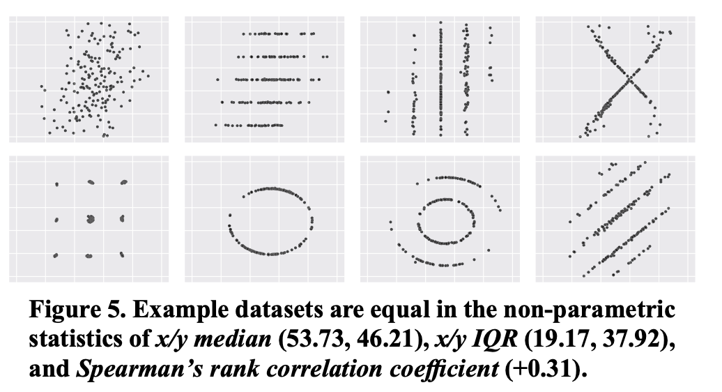
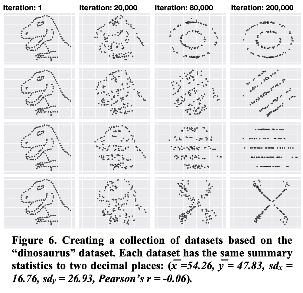
Note: you can find a lot of astonishing examples in Matejka, J., & Fitzmaurice, G. (2017, May). Same stats, different graphs: generating datasets with varied appearance and identical statistics through simulated annealing. In Proceedings of the 2017 CHI Conference on Human Factors in Computing Systems (pp. 1290-1294).
Compute descriptive statistics
Descriptive statistics (by opposition to inferential statistics) allow to summarize the observations in your sample.
Why is it important? Let's take an example!
Example 
Generate data 
# Seed the random number generator
np.random.seed(4)

# Set the parameters
mean_1 = 150.0
mean_2 = 200.0

small_std = 10.0
large_std = 50.0

n = 100
# Create the samples
val1_small_std = np.random.normal(mean_1, scale=large_std, size=n)
val2_small_std = np.random.normal(mean_2, scale=large_std, size=n)

val1_large_std = np.random.normal(mean_1, scale=small_std, size=n)
val2_large_std = np.random.normal(mean_2, scale=small_std, size=n)

# Print a few values
print("val1_small_std (3 first values):", val1_small_std[:3])
print("val2_small_std (3 first values):", val2_small_std[:3])
print("val1_large_std (3 first values):", val1_large_std[:3])
print("val2_large_std (3 first values):", val2_large_std[:3])
Visualize the distribution 
# Create figure and axes
fig, axes = plt.subplots(ncols=2, nrows=2, figsize=(16, 9))

# For each dataset (containing each two samples)
for i, (val1, val2) in enumerate(((val1_large_std, val2_large_std),
                                  (val1_small_std, val2_small_std))):

    # Create histograms
    ax = axes[i, 0]
    sns.histplot(x=val1, ax=ax, color="C0", kde=False, alpha=0.5, lw=0)
    sns.histplot(x=val2, ax=ax, color="C1", kde=False, alpha=0.5, lw=0)

    # Plot the theoretical mean
    ax.axvline(mean_1, ls='--', color='black', alpha=0.1, lw=2)
    ax.axvline(mean_2, ls='--', color='black', alpha=0.1, lw=2)

    # Set the axis lables
    ax.set_ylabel("Proportion")
    ax.set_xlabel("value")

    # Create a barplot
    ax = axes[i, 1]
    df = pd.DataFrame({"x": val1, "y": val2}).melt()
    sns.barplot(x="variable", y="value", ax=ax, data=df, ci="sd")

    # Add horizontal lines representing the means
    ax.axhline(mean_1, ls='--', color='black', alpha=0.1, lw=2)
    ax.axhline(mean_2, ls='--', color='black', alpha=0.1, lw=2)

    # Set the y limits
    ax.set_ylim(0, max(mean_1, mean_2) + large_std * 1.25)

plt.tight_layout()
plt.show()

The difference of means are identical but the dispersions are different. In one case, it seems adequate to consider that there is a difference between $X$ and $Y$, while it is not that evident in the other. Always look at the dispersion (STD/variance)!
Compute inferential statistics
What for? To reply to the question:
Can we generalize what we observe in our sample to the parent population?

Several test exist depending on the distribution of your data, the experimental design, and more generally the conditions of applications of each test:
- the t-test,
- the Mann-Whitney rank test
- the chi-squared test
- ...
Each of those gives a probability (p-value) to reject the null-hypothesis by mistake.
Example of application
Let's re-use the data from the previous example...
Visualize the data 
# Create figure and axes
fig, axes = plt.subplots(ncols=2, nrows=2, figsize=(16, 9))

# For each dataset (containing each two samples)
for i, (val1, val2) in enumerate(((val1_large_std, val2_large_std),
                                  (val1_small_std, val2_small_std))):

    # Create histograms
    ax = axes[i, 0]
    sns.histplot(x=val1, ax=ax, color="C0", kde=False, alpha=0.5, lw=0)
    sns.histplot(x=val2, ax=ax, color="C1", kde=False, alpha=0.5, lw=0)

    # Plot the theoretical mean
    ax.axvline(mean_1, ls='--', color='black', alpha=0.1, lw=2)
    ax.axvline(mean_2, ls='--', color='black', alpha=0.1, lw=2)

    # Set the axis lables
    ax.set_ylabel("Proportion")
    ax.set_xlabel("value")

    # Create a barplot
    ax = axes[i, 1]
    df = pd.DataFrame({"x": val1, "y": val2}).melt()
    sns.barplot(x="variable", y="value", ax=ax, data=df, ci="sd")

    # Add horizontal lines representing the means
    ax.axhline(mean_1, ls='--', color='black', alpha=0.1, lw=2)
    ax.axhline(mean_2, ls='--', color='black', alpha=0.1, lw=2)

    # Set the y limits
    ax.set_ylim(0, max(mean_1, mean_2) + large_std * 1.25)

plt.tight_layout()
plt.show()
Run test 
# Run a Student's t-test
t, p = stats.ttest_ind(val1_small_std, val2_small_std)

# Print the results
print(f"t={t}, p={p}")
# Run a Student's t-test
t, p = stats.ttest_ind(val1_large_std, val2_large_std)

# Print the results
print(f"t={t}, p={p}")
It turns out that the $n$ is so large, that the difference is statistically significant. Inferential statistics are a good tool to know if we could generalize what we observed (STD/variance)!
More about this in the next lecture!
Check for validity threats
- Internal: relative to your data; are the manipulation that you did the (main) cause of what you observe?
- External: relative to the relation between your data and the outside world; can we generalize what you observe?
Correlation is not causation
Why it is important? Let's take an example...
Example 
# Load the data
data = pd.read_csv(os.path.join("data", "corr.csv"))

# Plot the top of the file
data
# Create shorcuts for these very long labels
lab_cheese = "Per capita consumption of cheddar cheese (US) Pounds (USDA)"
lab_death = "People killed by immunosuppressive agents Deaths (US) (CDC)"

# Check for mispellings
assert lab_cheese in data.columns
assert lab_death in data.columns

# Create the figure and axis
fig, ax = plt.subplots(figsize=(12, 6))

# Create a line for the cheese consumption
sns.lineplot(x="year", y=lab_cheese, data=data, marker="o", color="C0",
             label="cheese consumption", ax=ax, legend=False)

# Create a duplicate of the axis for having a second y-axis
ax = ax.twinx()

# Create a line for the death number
sns.lineplot(x="year", y=lab_death, data=data, marker="P", color="C1",
             label="death number", ax=ax, legend=False)

# Make the legend
ax.figure.legend()

# Manually the placement of the x-axis ticks
plt.xticks(range(min(data["year"]), max(data["year"])+1, 3))

plt.show()

# Create figure and axis
fig, ax = plt.subplots(figsize=(12, 6))

# Plot the linear regressioin
sns.regplot(x=lab_cheese, y=lab_death, data=data, ax=ax)

plt.show()

# Compute the correlation coefficient
r, p = stats.pearsonr(data[lab_cheese], data[lab_death])

# Print the results
print(f"r = {r}, p = {p}")
You can find a lot of surprising spurious correlations here (and also create your own): http://www.tylervigen.com/spurious-correlations
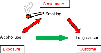
Counfound factors
Example 
Misrepresentation = misinterpretation
Why is it important? Let's take an example...
Example 
# Import the data
df = pd.read_csv(os.path.join("data", "rr.csv"))

# Plot the top of the file
df
# Create bins
df['DebtBin'] = pd.cut(df.Debt, bins=range(0, 250, 40), include_lowest=False)

# Compute the mean of each bins
y = df.groupby('DebtBin').Growth.mean()

# For the x-axis, compute the middle value of each bin
x = [i.left + (i.right - i.left)/2 for i in y.index.values]

# Create the barplot
fig, ax = plt.subplots(figsize=(10, 6))
sns.barplot(x=x, y=y.values, palette="Blues_d", ax=ax)

# Set the axis labels
ax.set_xlabel("Debt")
ax.set_ylabel("Growth");

However, here is what the raw data look like:
# Create the figure and axis
fig, ax = plt.subplots(figsize=(12, 9))

# Plot a scatter instead
sns.scatterplot(x="Debt", y="Growth", data=df, ax=ax);

The 'step' effect is an artefact due to the misrepresentation of the data. So: (i) Look at your raw data!, (ii) Choose a representation adapted to the structure of your data.
Adapted from the errors from Reinhart, C. M., & Rogoff, K. S. (2010). Growth in a Time of Debt. American economic review, 100(2), 573-78. and the critic from https://scienceetonnante.com/2020/04/17/austerite-excel/ (in French) and corresponding GitHub repo: https://github.com/scienceetonnante/Reinhart-Rogoff.
To see a (serious) critique of this article: Herndon, T., Ash, M., & Pollin, R. (2014). Does high public debt consistently stifle economic growth? A critique of Reinhart and Rogoff. Cambridge journal of economics, 38(2), 257-279.
One figure from the original paper:
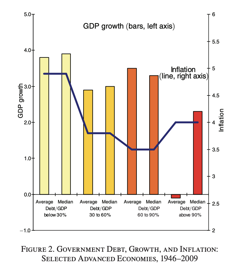
It is probably possible to do better: this representation leads to misinterpretation!
More on this during the 'data visualization' lecture!
Occam's razor
For a contextualized explanation, you can refer to the Stanford Encyclopedia: Baker, Alan, "Simplicity", The Stanford Encyclopedia of Philosophy (Winter 2016 Edition), Edward N. Zalta (ed.), URL = https://plato.stanford.edu/archives/win2016/entries/simplicity/.
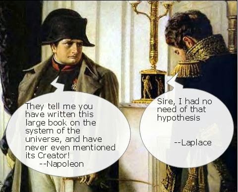
Laplace went in state to Napoleon to present a copy of his work [...]. Someone had told Napoleon that the book contained no mention of the name of God; Napoleon [...] received it with the remark, 'M. Laplace, they tell me you have written this large book on the system of the universe, and have never even mentioned its Creator.' Laplace [...] answered bluntly, [...] "I had no need of that hypothesis."[...] Napoleon, greatly amused, told this reply to Lagrange, who exclaimed [...] "Ah, it is a fine hypothesis; it explains many things."
From W.W. Rouse Ball A Short Account of the History of Mathematics, 4th edition, 1908.
If all of chemistry can be explained in a satisfactory manner without the help of phlogiston, that is enough to render it infinitely likely that the principle does not exist, that it is a hypothetical substance, a gratuitous supposition. It is, after all, a principle of logic not to multiply entities unnecessarily (Lavoisier 1862, pp. 623–4).
[T]he grand aim of all science…is to cover the greatest possible number of empirical facts by logical deductions from the smallest possible number of hypotheses or axioms (Einstein, quoted in Nash 1963, p. 173).
Both quotations from the Stanford Encyclopedia.